
A new brand identity for the largest professional association in the movement industry in Switzerland. We accompanied the realignment step by step and developed a moving brand identity.
- Disciplines Branding, Digital
- Project Duration
- 2018 >
- Website
- www.bgb-schweiz.ch
Prior to designing, the positioning of the association was deepened in a workshop. The results served as the strategic basis for the redesign.
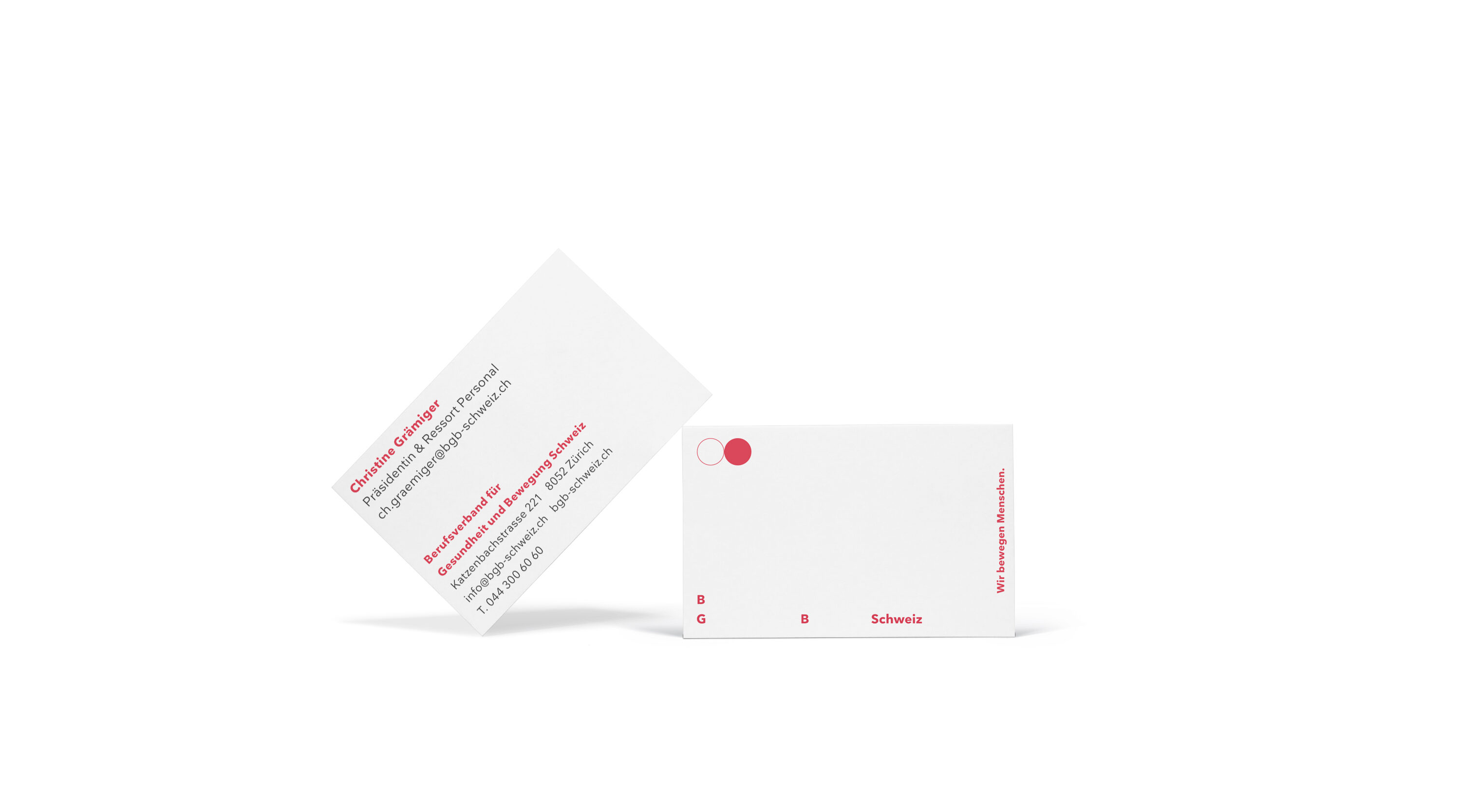
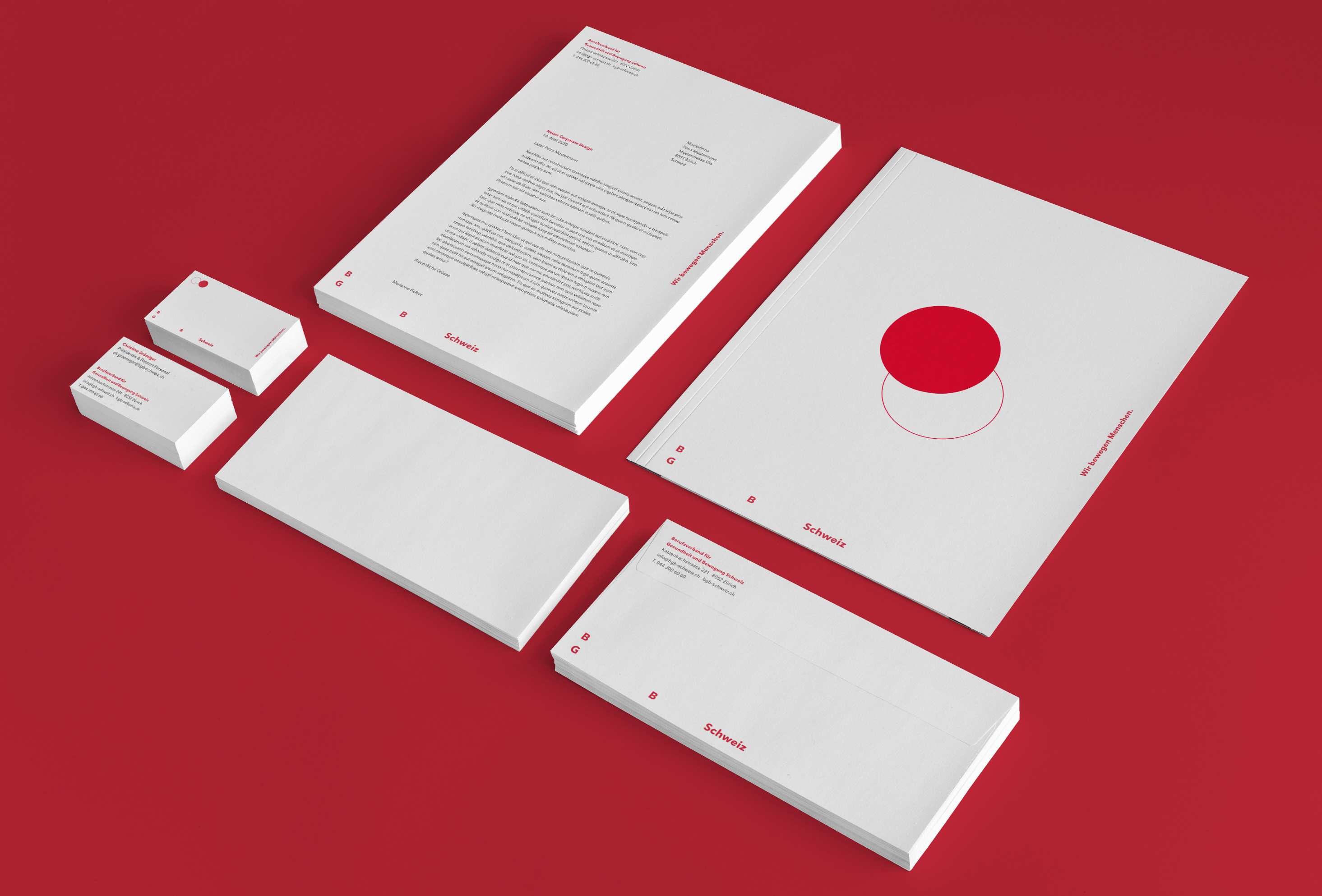
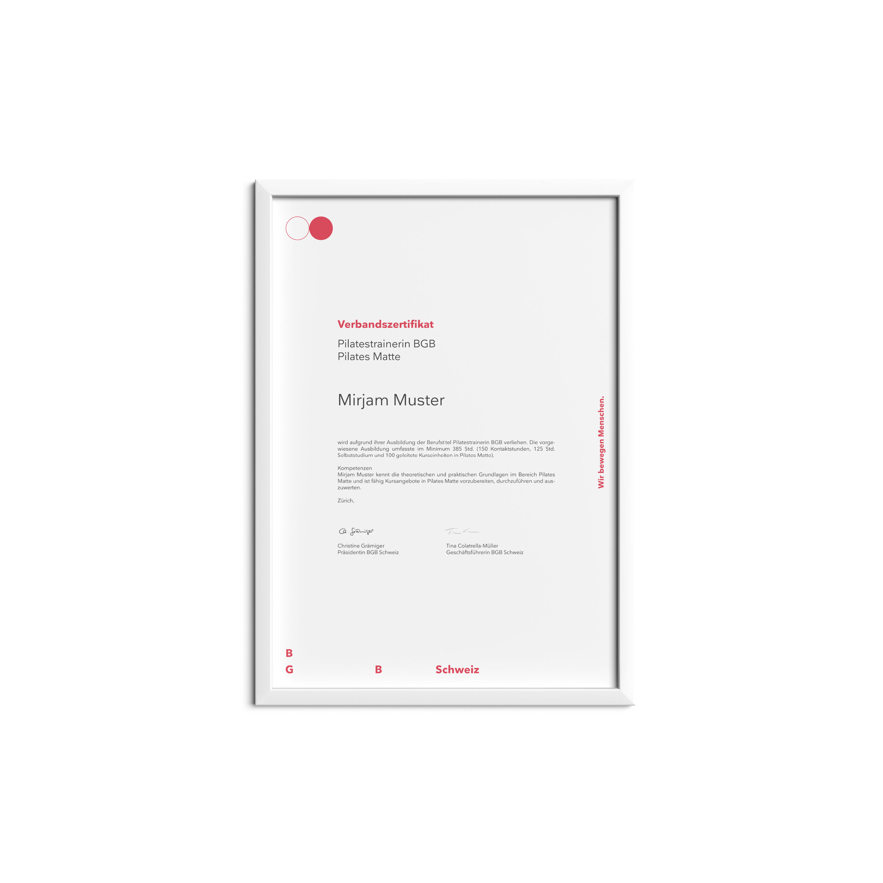
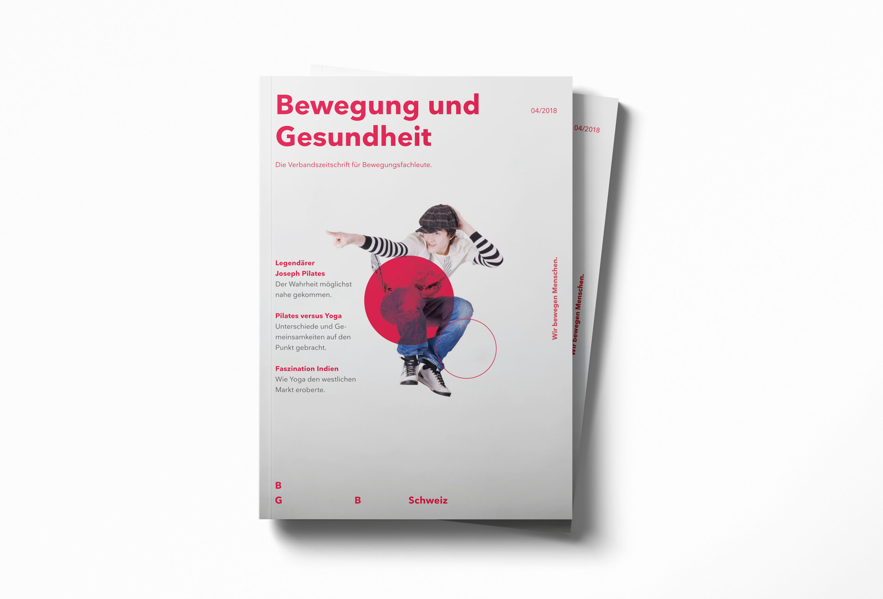
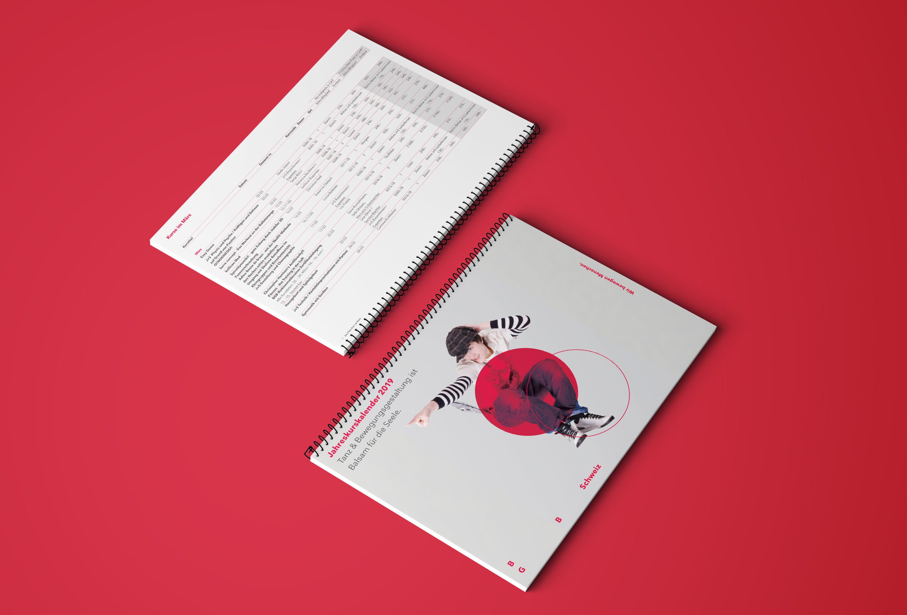
It’s all about «movement»
In order to convey movement visually, the name of the association was reduced to its initials. The result is a simple yet concise word mark, which, through the relationship between the design elements, gives the impression of moving in a playful way.
The design element
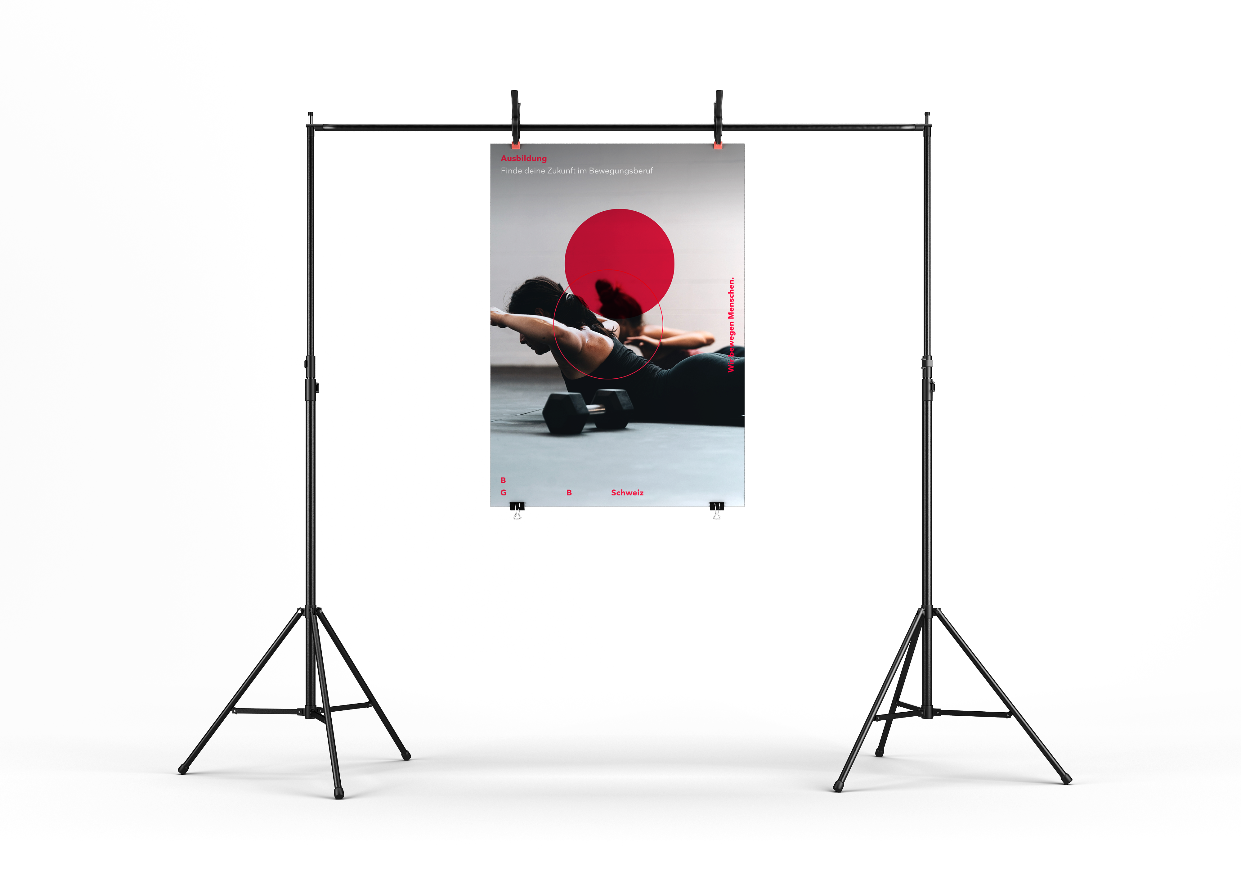
The circle: The perfect shape to represent a state of endless motion. The possible uses are diverse; as pictograms, to accentuate image areas, etc.


Website as a tool
The association’s online presence has been completely renewed. In addition to the visual and technical revision, the information architecture was analysed and restructured. Thanks to a flatter hierarchy and the new grouping of topics, it is easy, intuitive and user-friendly. Course registrations and confirmations are easily viewed and obtained via the user profile.
The autonomous administration of the profile data of members and lecturers as well as the course is easily done via the protected member area. The administrative effort on the part of BGB was thus significantly reduced.